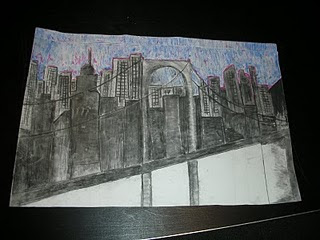
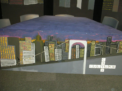
during the first week we were put into five groups of four. In these groups we were each given a role. i was assigned as an art director. As an Art director it was my job to come up woth ideas for a set design. there was five art directors in the class. the first thing we had to do was decide on the set design. as a group we were very indecisive about how to design our set. At first we all had different ideas on how to design the set. Eventualy we all agreed on the idea of having a city-scape. we named the final idea Culture City. The idea was to paint a city scape onto the flats (wood boards) and connect them together to create our set. We layed out ou tlines of the buildings using masking tape, and filled them in. the colours we used were greys and blacks, we then used purples and dark blues to create a midnight effect on the sky make it seem that it was nightime in the city. We also added additional colour in the form of bright yellow and orange to represent the lights from the buildings, however we only did this for two of the flats to create depth in the set and make it seem that some buidings were further away than the others.
 tlines of the buildings using masking tape, and filled them in. the colours we used were greys and blacks, we then used purples and dark blues to create a midnight effect on the sky make it seem that it was nightime in the city. We also added additional colour in the form of bright yellow and orange to represent the lights from the buildings, however we only did this for two of the flats to create depth in the set and make it seem that some buidings were further away than the others.
 this is the final design that we painted on the front of the set.

And this is the final set design. i think it turned out pretty good.


No comments:
Post a Comment